This post mortem is an archive from my 2011 blog post on my previous site
Genesis
 Knight’s Quest is an action-RPG, released in late February 2011 on Facebook. It mixes Hack’n’Slash mechanics (think Diablo) with a social layer as for a lot of those “social Facebook Games“. The particularity of Knight’s Quest is that it aims at a slightly different demographic, targeting the more “hardcore” players, the nostalgics of dungeon-crawling, the ones that want their quick Diablo-fix in between two posts to their friends.
Knight’s Quest was originally supposed to be a port/update of Two Kingdoms on Facebook, but the game sort of drifted in another direction, which I will explain in the “post-mortem” section.
It was produced with the folks at Gaming Your Way, and financed by Utinni Games. I was in charge of everything graphic (direction, production, and for some parts, integration…) and, at first, of the general game design.
Creating a comfy starting zone
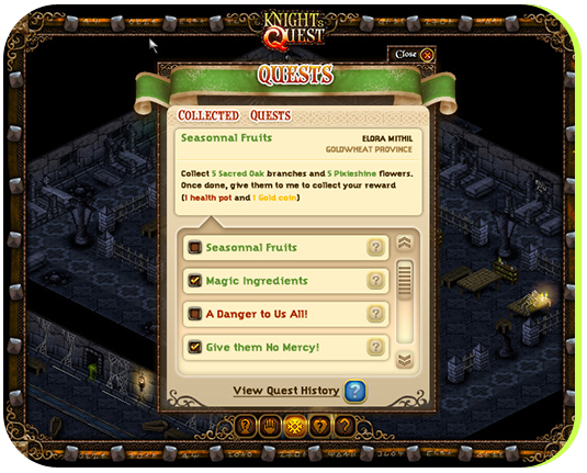
 The player starts in a quiet village, in the Goldweat Province. The village (whose name will be chosen by the player) serves as a base camp for the player: both a home and a quest HUB. The village is where most of the social interactions will take place, and needed to feel welcoming and quaint.
Often, in the old 16 bits games, the “Town” areas felt somewhat blend to me, like if designers had spent way more time giving personality to the dungeons than designing a town/village that felt welcoming. While it may make sense for a game where players never spend too long at the same place, in our case, the village is a place that players will see again and again, after each dungeon crawl, after each quest, etc. To achieve that truly welcoming feel, I knew that diversity was paramount: the town itself has more “unique” tiles than any dungeon in the game.
 At that point, Knight’s Quest was still supposed to be a port of Two Kingdoms – so I was able to tap in a wealth of tiles (Two Kingdoms included more than 150 unique tiles for the village set-up, and Knight’s Quest uses 118 of them). All the tiles were created pixel-by-pixel in Photoshop, then assembled by hand in Flash.
One really nifty feature of the game is that all the level design actually happened within Flash: no need for cumbersome XML editors – the maps where assembled directly in the Flash IDE – still layered, to separate what belongs to the background and that will end up being back in a big image, and what needs to be Z-sorted with the player, in the foreground.
Using the IDE was a blessing, as Flash includes some nice features that are not always available in the custom map editors. Another nice feature was the possibility to place any element of the background wherever I wanted, without having to respect a grid based layout (although, I didn’t use that option that much, as my tiles were previously generated for a full grid based layout, and their “squareness” wasn’t looking too great with the freeform level design).

The final Village level really pushed the Flash IDE to its limits – copying and pasting tiles was bringing Flash to a crawl! This said, the result in-game is incredibly more fluid, as the biggest bulk of those tiles, the background, is baked at runtime to be one big image: all the advantages of a large image (the engine doesn’t have to move thousands of elements) without the inconvenient (file-size is small, because all that is downloaded are the small tiles).
The in-game map is rather large: the whole area covered by the village is roughly equivalent to 2000*1000 pixels: enough to have a good walk among all the houses hosting your Facebook friends!
From being comfy at home to dwelling in dangerous places.
 Of course, what would be a Hack’n’Slash with no dungeons to explore?
The first dungeon is always delicate to design for several reasons: it needs to be easy enough, almost “low-profile”, so that players can learn the ropes of your game mechanics, but completing it still needs to be an accomplishment – the player needs to feel like he/she went through something epic. The first dungeon is there to hook you up to the game and leave you wanting for more.
I originally thought of BoneChewer’s Lair back in the day, when I was designing Two Kingdoms Heroes. The dungeon (or more accurately, a network of connected caves) was supposed to be right next to the village, easily accessible by the players. Because the whole Goldweat map needed to feel bucolic, it couldn’t be too apparent, hence to choice of the cave. From there, I started to come up with various dramatic stories that would support the quests and rewards pushing the players towards that first dungeon experience.
BoneChewer is a fabled giant wolf that wanders around the village, occasionally abducting cattle or small children. The villagers are too afraid to really go after it, and it will be the player’s task, as a hero, to put a stop to BoneChewer unpunished actions.
Designing the first main villain (Boss)
 To create BoneChewer, I worked with Brandon Moore, a very gifted future concept artist, currently studying at SCAD (and featured in these columns for the project Ragged Edge).
I told Brandon what I was looking for:
Bonechewer: is the first Boss the player will encounter. It’s a big, scary wolf – the animal has been “perverted” by the crystals, so it glows an unhealthy green, and blows greenish smoke. I originally envisioned some sort of tribal collar made up of the skulls of its victims (stuck in the hair) around his neck
and let him work his magic – He came back with a series of sketches that were very satisfying – We picked the best iteration (I like the white wolf a lot too, but it would have looked “off” in a predominantly dark environment) and he moved ahead to the “action shot”

Brandon has been working with me for a few months, on his portfolio. I thought it would be a good exercise to take the concept character further, and refine it to a more fully “illustrated” painting. Additionally, having that more refined image would also help me greatly once I was to redraw the character pixel by pixel.
Brandon blocked the tones in greys, defined the general composition, attitude and we worked together on an appropriate color palette. I wanted a very vibrant, almost comic-like approach, that would make the animal ridiculously menacing, and after a few tries, we found the right tonalities.
 Now that BoneChewer was alive under Brandon’s pencil, it was time to turn it into a game asset. I basically took Brandon sketch and started to redraw the monster, pixel by pixel – using shading brushes to give it a smoother look. Because BoneChewer was sporting some very recognizable features (the skull neck piece and the glowing wounds/tattoos) it wasn’t too hard to convert it to a small isometric asset. This is where one realize how important “original” character design is.
As usual, the frame by frame animation is what took me the most time. The BoneChewer sprite-sheet includes various animations, ranging from walking cycles, attack cycles and even a death cycle. All in all, the BoneChewer sprite-sheets sports 35 frames to cover all needed animations. Aside a few glitches on the walk animation (the poor Wolf’s hips bones are barely noticeable under the abundance of fur on its back)
 Unfortunately, it was later decided that dungeons would not include Bosses, so BoneChewer and his minions never made it to the final game :(.
This said, I would expect to see more of him once I get Two Kingdoms under production ?
Giving our monster a place to haunt
All that was left ( O.O ) was to build a place worthy of our terrifying monster. There again, the concept art went a long way providing me hints for how to build the environment, the color palette, etc. Designing the cave was also an occasion to refine the mythology around BoneChewer, and I started carving a rough storyline in my head, as I was drawing the tiles.
 BoneChewer’s Lair was becoming more than a scary dark pit. The bones collar around the monster’s neck hinted that the animal had once been worshiped by humans (or humanoids) … maybe fed through sacrifices. It is very possible that this stopped at some point, and that the famished wolf had to actually find its food elsewhere, which would explain its excursions outside of the cave, and the abduction of villagers, children, etc.
So, aside the usual rocky walls, dusty tiles and other various stalactites, I decided to give the cave some tiles that would hint at a past civilized presence: destroyed tiled floor, columns, totems and run-down temple elements. This also allowed to give much more personality to that first dungeon, and would allow to bring some rhythm in the level design as well.
One particularity of Knight’s Quest is that all the dungeons are randomly generated. Now, there are several ways to randomize a dungeon, so let me give a little bit more detail on what KQ’s approach is: a dungeon is basically a succession of rooms and hallways. These rooms can have various sizes, and the hallways various lengths and directions. We build, and designed all the possible variations for hallways and rooms, in sets of “chunks”, each being 4*4 tiles. The engine then builds a sort of labyrinth using these chunks to connect hallways with other hallways or rooms. The end result is a semi-designed dungeon, that still carries the feel that it has been carefully put together (for the amount of detail and level design one can inject in one chunk) while allowing the extreme replayability of completely randomized dungeons.
For those interested, you can find a more technical explanation here and here.
Giving ownership of the main character to the players
 I toyed with various ways to “render” the character, from 3D models to realistic sprite and ultimately locked my choice on the “cute” anime-style characters that players loved in the Final Fantasy series, for example. There are various reasons to go with that art style: first, it’s an all-time favorite for players, but it’s also very simple to animate – the character design is simple, and the limbs don’t “fold” – particularly to create the clothes and various equipment items, it would prove useful.
The sprite sheet renders all the animations, in the 4 isometric cardinal directions. The character can walk, stand breathing, fight unarmed, fight armed, perform magic attacks, and finally, die ?
As you can see it’s a lot of frames! and it’s even more frames when the character needs to carry visible equipment. Character fine-tuning and equipping are staples of the RPG genre. I knew there was no way around it, so I searched for the most efficient way to handle the multiple sprites this would require.
The character spritesheet handles the “naked” character (well, technically, you can’t get naked in Knight’s Quest, you’ll always wear shorts and a shirt :)). Clothes (and weapons) are independent spritesheets that are overlaid on top of the character, as shown in the following image.

by multiplying the overlays, the final result shows an animated avatar that can wear recognizable equipment. Carefully designing the equipment so that several pieces can share the same spritesheet is of course a trick to decrease the needed amount of assets ? … nevertheless, Knight’s Quest at launch featured a little over 55 different “wearable” items, at 92 sprites/position per sheet, it’s more than 5000 sprites designed ?
Designing the User Interface
 The UI topic could take a whole new blog post, but I wanted to quickly cover style, over substance (for substance, I’ll pick another game :)) – I’ve done a LOT of UIs, for a whole bunch of games. Going back on my portfolio, I realized that my interfaces can usually be a bit too crowded. I always like to tie back the UI to the game look and feel, and I usually use colors, textures and little decorative elements, so that the UI feels as part of the same world as, let’s say, the sprites.
Looking back on some past UIs, I think it was a mistake – Two Kingdoms‘ interface, for example, didn’t age very well: it was pretty cool when the game came out, but almost 10 years later, it just doesn’t feel right anymore…
For Knight’s Quest, I approached UI differently: I tried to keep the decorative elements out of the way of the interactive elements, and design the user areas as simple as possible, relying on slight gradients/lighting rather than texture to keep a “rich” feeling, without visually cluttering the whole experience.
So, as a result, this set of User interfaces sports much less textures, graphic work than my past work, but I honestly think it’s for the best ? – now, feel free to disagree with me in the comments, but that’s where I stand for the moment. I’m impatient to design my next RPG UI to see where I can take this further and refine the style…
Note: since launch, the UI has evolved in places that I didn’t designed – and that I don’t necessarily like – Unfortunately, as time goes by and the game evolves, new UIs, new sprites and new environments will be introduced, that I didn’t have control over.

Post Mortem
This was, to say the least, a learning experience.
As I mentioned in the “genesis” introduction, originally, Knight’s Quest and Two Kingdoms Heroes where the same project. Squize and I had been pitching to various investors the concept of a Two Kingdoms Heroes version for Facebook. Basically, a single player RPG experience, storyline driven, that would also incorporate key social components in its gameplay.
 As I noted in an earlier post, it wasn’t too successful: we had some investors interest, but it clearly became apparent that without a working demo, we wouldn’t be able to collect the fund to start the project (ironic, isn’t it? :)).
When Utinni Games offered to sponsor the project, and inject some funds to help quick-start it, it felt like a dream come true: being self employed, I had some free time (although working on the finishing touches for the space racing game, Ragged Edge, that was due within the next few months) and it was something I would have worked on, regardless.
For the first month or so, everything was going fine – everybody was satisfied, the project was moving forward, and I was getting really excited about the prospect of trying my hands in that first Social Gaming project.
Then, things got bad.
 One big mistake that I made was to accept the project without getting signed-in on a somewhat detailed Game design document – this will NEVER happen again!
Instead, we started diving in making the game right away, writing the documentation as we were moving forward.
Of course, Two Kingdoms Heroes had ample documentation ( around 70 pages of GDD goodness) – but it didn’t come to my mind to get a “social-network tweaked” version of this document to our financial partner before starting the work. We all had various talks of what we wanted to make, but now, I know that we failed realizing how much our individual approach on the genre were different.
 As I was writing the documentation on storyline-driven quests, dungeon design, bosses, loot, etc, it became very apparent that we had major disagreements on what that project was supposed to be ?
That’s where a second mistake comes in – We collectively agreed on some very generic deadlines, assuming that a lot of the assets needed for the game would be covered by the Two Kingdoms Heroes assets (I have multiple “worlds” and tilesets already created, and even mapped, for some).
As some key features were cut out of the game, or pushed against, I realized that the game wasn’t going to be the RPG I wanted to make, so I became very reluctant using the assets originally created for 2KH. It was too late to backtrack on replacing the assets that were already injected in the game (the village, for example, or some tiles in the “Caves” dungeon) and there was very little time, or budget left to create what was missing.
Now, I feel that to be completely fair, I need to explain a little bit my stance on the assets creation: although the original funding was a very honest attempt at paying our development time on the project, it was also not in line with the time actually spent on creating the various tiles that I had created for 2KH. Actually, the time I spent mapping the village in Flash, or laying out the various dungeon rooms, combined with the time creating and laying out the UI completely covered the “art budget”.
As long as this project was a partnership, to bring the essence of 2KH to Facebook, I was fine providing more and more assets at no additional cost – they were readily available, the Facebook game was supposed to be a glorified version of 2KH, and I was thinking about the long-term investment, the big picture…
But when it became apparent that very little of what I originally wanted for Knight’s Quest would make it into the final cut, I realized I was pouring my assets into someone else’s game, for a fraction of the fee I would have normally asked for. Rather than put these assets on sale, I decided to carry on creating the rest from scratch, and salvage my 2KH assets for further usage.
To add on the disastrous unfolding of events, as the project was lingering on, I stopped being “self employed” and took a full time position at my former employer. At that point, all the “deliverable” had been met, the V1 of the game was fully functional, and I was free to move on.
But when Utinni Games decided to add more assets, to create additional dungeons, monsters, etc, it was too late – I wasn’t able to commit to their short deadline, as I could have been if I had worked full-time on it. That marked the end of my collaboration on the project.
Learnings and final thoughts
 I think that with a stronger document to start with, and to agree upon, a lot of this could have been avoided – if I had understood at first that Knight’s Quest was to become Utinni’s sole responsibility and property, I would have created everything from scratch on day one, and we would all be in a happier place now – (however, the game would certainly be thinner in terms of assets). Instead of what, I feel robbed of my “baby”, and I’m sure that on their side, they feel that they had to put up with some sort of diva. in short, the experience has been a headache for everyone involved.
As far as the final product goes, the frustration comes from knowing the potential that this game had to provide a deep RPG experience within Facebook, which, to my knowledge, no social game have done yet. Instead, in my eyes, Knight’s Quest is a very well executed, pleasant RPG, but that really never deliver the goods to keep me playing. I have no sense of progression, I don’t care much for any of the places/dungeons or enemies, because there is no story to cling on – or because there is no dramatic payoff, like a boss to beat.
Basically, I don’t have a sense of purpose, which I believe is one fundamental aspect a RPG should deliver on.
 Indeed, I do believe that dungeons need climatic ending, with Bosses, to tell players that they achieved something epic. And these Bosses don’t impact the dungeon replayability – quite the opposite, as World of Warcraft clearly demonstrated.
I do believe that piling up dungeons and quests in the same hub is a mistake, that players need visual and intellectual progression – from a village, take them to a town, with more houses to populate, and new logical (I mean, logically related to the area) dungeons to explore. Sense of progression is a must have.
I do believe that storyline shouldn’t be sacrificed for replayability’s sake – that if you are going to send players slay spiders more than once, you’d better have a good reason to do so.
I do believe that throwing a few dungeons and a few baddies in the mix, for players to kill, isn’t going to make a very compelling experience without an over-arching goal, something big to defeat, or an intriguing story to unveil.
 I do believe that RPG stands for Role Playing game, and that the first two letters are the most important – and that playing a role when you ignore the context is a difficult task ?
I would argue that randomization of dungeons floor plan is not as an “acute” factor of replayability versus well designed content, clever and climatic floor plans, that people want to experience more than once – beating a labyrinth because you came to learn it is a powerful thing, particularly if the place has a fun design, and if you can somewhat relate to it as a real, scary place. Now, randomization of rewards, in the other hand is a compelling “replay” factor, but that means that you need to have bosses, and multi-drop tables per boss ?
Well… there are many things that I believe, and that are not in this game…yet…because I’m sure it will have to happen, by players’ demand, or investors requests.
Knight’s Quest has been reviewed twice, and aside the reviewers being occasionally too demanding for a game that they tested in “beta”, I agree with a lot of points mentioned – no need to cover them in this post-mortem ?
 Read the first review at: http://www.insidesocialgames.com/ and the second at : http://www.gamezebo.com
In a sense, this whole experience is laying out the bases for what my next RPG on Facebook should be – and definitely brought to light some weak aspects of my original game design on 2KH that will have to be corrected to provide the best, hardcore, gaming experience on the social network.
I’m just terribly disappointed that Knight’s Quest couldn’t be the opportunity to do that ?
You can play the game, and see for yourself, on Facebook, at this address.

